Most SaaS Onboarding Fails Before the Second Login
Ritika Dongol, Product designer
Ritika Dongol
Product designer
Ritika Dongol shapes digital experiences that people actually want to use. As a Product Designer, she bridges the gap between user needs and business goals, turning complex problems into interfaces that feel intuitive, not engineered. Her work spans UX research, interaction design, and design systems, giving her the end-to-end perspective that most projects rarely get from a single designer.
09 Jun 2026

SaaS onboarding UX best practices are discussed constantly, but most teams implement them backward. The mistake is treating onboarding as a welcome sequence: a checklist, a few tooltips, an intro email. Onboarding is not orientation. It is the shortest path between a user signing up and that user experiencing the core value of your product. When that path is unclear, long, or full of friction, users leave before they ever understand what they signed up for.
- Activation is the first time a user experiences the core value of your product. Design onboarding to reach it fast, not to tour every feature.
- Showing users too much too early is the most common onboarding mistake. Each step before activation is a point where users can leave.
- Reduce signup friction to only required fields. Users who abandon at signup never see the onboarding flow at all.
- In-app guidance (tooltips, empty states, inline prompts) outperforms email sequences for keeping users on track.
- Progressive disclosure hides features until they are relevant, reducing cognitive overload and increasing completion rates.
What Activation Actually Means in SaaS
Activation is the moment a user experiences the specific outcome they signed up for. It is not creating a profile. It is not completing a tutorial. It is the first time the product delivers on its promise in a way the user recognizes as valuable. For a project management tool, activation might be inviting a teammate and seeing a task assigned. For an email platform, it might be sending the first campaign and watching open rates appear. The exact moment differs for every product, but every product has one. Most onboarding UX fails because the team has never precisely defined what their activation moment is.
Research by Mixpanel found that users who reach activation within the first session are significantly more likely to return and convert to paid. The mechanism is direct: if a user experiences value before closing the tab, they have a reason to come back. If they don't, they won't. The onboarding UX job is to reach that moment as fast as possible, not to teach users everything the product can do.
The Most Common Onboarding Mistake
The most common onboarding mistake is showing users too much too early. Feature-heavy onboarding flows treat every capability as equally important. On day one, only one thing matters: the activation moment. Everything else is noise that extends the time it takes to get there. Practitioners report that onboarding flows with five or more required steps before core value see significantly higher drop-off than flows with two or three. Each step is a decision point where users can leave.
The instinct to showcase features during onboarding is understandable. Product teams want users to see the full value of what they built. But the user hasn't earned that context yet. They signed up to solve a specific problem. Walk them to that solution first. Showing users everything on day one is not generosity. It is noise.
Best Practice 1: Reduce Friction at Signup
The onboarding experience starts at signup, not after it. A long registration form with required fields for company size, team name, industry, and role tells the user that accessing the product is going to be work. Remove every field that is not strictly necessary to create the account. For most products, that means name and email only. Additional information can be collected progressively once the user is inside and already experiencing value.
Single sign-on with Google or GitHub removes one more barrier. The fewer decisions a user has to make before they see the product, the more users actually reach onboarding. Friction at signup is not recovered during onboarding. Users who abandon at the signup step never see the flow at all.
Best Practice 2: Design Toward a Specific Activation Moment
Define your activation moment before designing the onboarding flow. This is a product strategy decision before it is a UX decision. Ask: what is the single action that makes a user significantly more likely to return? Answer that with data if you have it, or with a hypothesis if you don't. Then build the onboarding flow to get users to that action in the fewest possible steps.
The activation moment should feel like an achievement when it happens. When a user completes the action that defines activation, they should know something good just occurred. Confirmation messaging, a visible change in the interface, or a small celebration moment signals they have crossed the threshold. Users who feel progress are users who continue.
Best Practice 3: Use In-App Guidance, Not Just Email Sequences
Email onboarding sequences are useful, but they are not onboarding UX. They are reminders. The actual UX happens inside the product. Users who are confused inside the product do not open emails to find help. They close the tab. In-app guidance places help exactly where the user needs it: at the moment of confusion, inside the interface, without requiring the user to leave or switch contexts.
Tooltips, empty state copy, and inline prompts are the primary tools of in-app guidance. Empty states are particularly underused. When a user first enters a dashboard with no data, the empty state is the first thing they see. It should not say "No data yet." It should tell the user exactly what to do next and explain why it matters. Research by Nielsen Norman Group identifies empty states as one of the highest-impact moments in onboarding and one of the most consistently neglected.
Best Practice 4: Strip the Onboarding Interface
The onboarding interface should not look like the full product interface. Full navigation, all settings panels, and every feature visible at once creates cognitive overload before users have context to make sense of any of it. Progressive disclosure is the governing principle: show users what they need, when they need it, in the order they need it. Everything else stays hidden until it becomes relevant.
This is a decision product teams resist because hiding features feels like withholding value. It is the opposite. Users overwhelmed during onboarding do not explore features. They leave. Users guided to one clear outcome who achieve it during the first session become the explorers who later discover advanced features. The sequence matters more than the volume of features presented.
Onboarding is not a tour. It is not a checklist. It is the designed path between signing up and experiencing the outcome your product promises. Users don't stay because the product is good. They stay because they understood it fast enough to see that it was good.
Frequently Asked Questions
What is activation in SaaS onboarding?
What are the most important SaaS onboarding UX best practices?
Why do users drop off during SaaS onboarding?
What is progressive disclosure in onboarding UX?
How long should SaaS onboarding take?
What is an empty state in SaaS onboarding?
What is the difference between SaaS onboarding and activation?
- Product OS by Ayush Lagun
Better product decisions for founders.
A weekly briefing on product clarity, planning trade-offs, and judgment calls, including when AI helps and when it doesn't.
You may want to read this too
A few posts that pair well with this one.
6/30/2026
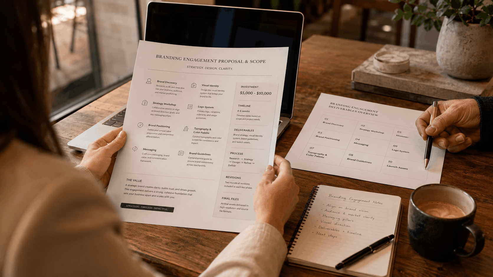
What a $5K–$10K Branding Engagement Actually Includes
Most founders have no idea what they're buying when they invest in branding.Not because the inf...
RReeaadd mmoorree
6/28/2026
What We Look for Before Taking on a Client
Most agencies say yes to almost everything. A budget shows up, a brief arrives, and the work begins....
RReeaadd mmoorree
6/27/2026
Why the Last Agency Didn't Move Your Numbers
Your product looked better after. The website was cleaner. The rebrand felt like progress.Then three...
RReeaadd mmoorree