Why products that look good still fail to convert
Ayush Lagun, Product Designer
Ayush Lagun
Product Designer
Ayush Lagun helps established non-technical businesses build brands and websites worth their reputation. Before starting Duiverse, he spent years working across brand strategy, design, and digital, giving him the full-stack perspective most agencies split across five different vendors.
10 Mar 2026

Many digital products today look beautiful. The interface is clean. The colors are modern. The layout feels professional.
Teams invest months building design systems, animations, and polished user interfaces. At Duiverse, we often see this happen when companies focus heavily on visuals but overlook the importance of clear product direction and user experience structure.
But then something strange happens.
Users visit the product. Some sign up. Very few continue using it. Conversion stays lower than expected. Adoption grows slowly. Teams begin to wonder what is missing.
The product looks good. So why is it not working? In many cases, the answer is simple: good design is not the same as clear design.
Many teams realize this only after launch, when users start dropping off despite strong traffic. Fixing that usually requires stepping back and rethinking how the product communicates value, structure, and user flow. This is exactly the kind of problem we work on at Duiverse, where we help founders turn complex ideas into clear digital products that users immediately understand.
More features don't always solve the problem
When products struggle to convert, teams often try to fix the problem by adding more features. Instead of solving the real issue, teams introduce new dashboards, tools, and functionality. In many cases, the better approach is improving product UX structure and user flow, something we focus on in our product design and development services.
But if the core experience is confusing, adding features usually makes the product harder to understand. Users rarely adopt products because they have many features. They adopt products because the main value is easy to understand and easy to adopt.
When complexity increases before clarity is established, the product becomes more difficult to use.
Clear products guide users naturally
Products that convert well tend to share a common pattern. They make their value obvious quickly. Users understand what the product does without needing long explanations. They guide users toward a clear next step. Each screen helps users know what action they should take.
They keep the experience consistent. Design, structure, and messaging all follow the same logic. When these elements work together, users feel confident using the product. Confidence leads to action.
Clarity drives product growth
Many teams believe growth comes from adding features or increasing marketing spend. But clarity often has a much bigger impact. When users immediately understand a product, they trust it faster. When they trust it, they are more willing to explore, adopt, and continue using it.
Confusing products rarely fail dramatically. Instead, they grow slowly or stop growing entirely. Users visit but hesitate. Traffic increases but conversion stays low. In many cases, improving clarity unlocks growth that already exists inside the product.
Sometimes the most powerful change a product can make is not adding something new, but making the experience easier to understand.
TLDR:
A product can look modern but still confuse users.
Most users scan interfaces instead of reading them carefully.
If users cannot understand the product in seconds, they hesitate.
Adding more features often increases confusion instead of solving it.
Clear product structure and guidance improve trust and conversion.
- Product OS by Ayush Lagun
Better product decisions for founders.
A weekly briefing on product clarity, planning trade-offs, and judgment calls, including when AI helps and when it doesn't.
You may want to read this too
A few posts that pair well with this one.

6/5/2026
Why Your Website Looks Unprofessional (And It's Not What You Think)
My website looks unprofessional. It is one of the most common things business owners say when they a...
RReeaadd mmoorree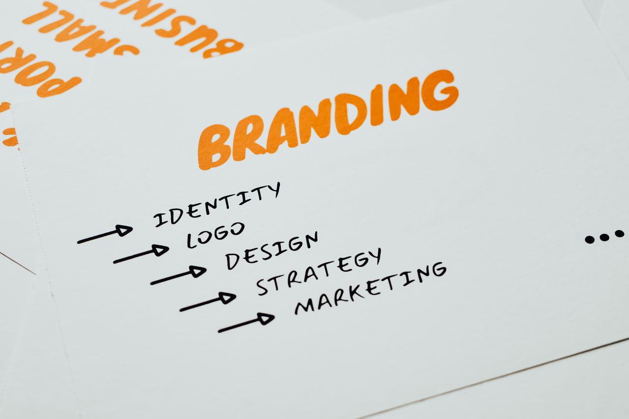
6/3/2026
Branding for non-technical founders: what actually works
Most non-technical founders approach branding the same way: they hire someone, feel confused by the ...
RReeaadd mmoorree
6/2/2026
How to look credible as a business before you have a track record
You started a business. You have no reviews, no case studies, no press mentions, and no portfolio of...
RReeaadd mmoorree