Why your pricing page makes good clients walk away
Ayush Lagun, Product Designer
Ayush Lagun
Product Designer
Ayush Lagun helps established non-technical businesses build brands and websites worth their reputation. Before starting Duiverse, he spent years working across brand strategy, design, and digital, giving him the full-stack perspective most agencies split across five different vendors.
18 Jun 2026
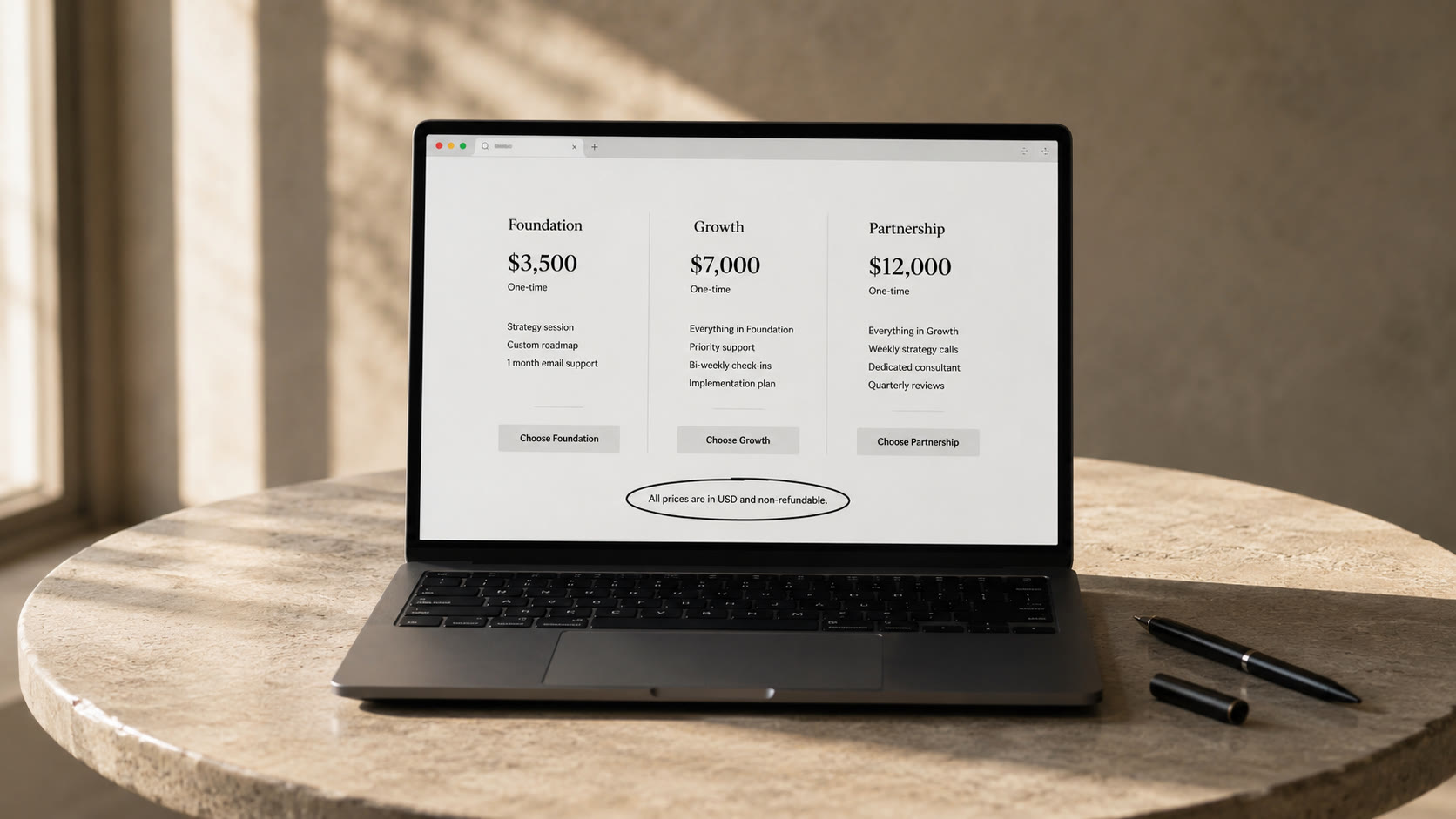
Your pricing page is not losing clients because your prices are too high. Good clients do not leave a pricing page over the number. They leave because the page fails to answer the question forming in their mind before they ever see the number: is this decision safe to make? When context is missing, even a well-priced service feels like a risk. Understanding why pricing pages fail to convert is not a question of strategy. It is a question of sequence.
Most pricing pages are built backwards. They lead with the cost structure and leave the trust-building to the bottom of the page or to a future sales call. The problem is that good clients make their decision before they reach out. By the time they contact you, they have already evaluated your pricing page and decided whether to proceed. A page that does not resolve doubt before the price does not get a second chance.
- Good clients leave pricing pages because the page does not make the decision feel safe, not because the price is wrong
- A page that leads with outcomes converts better than one that leads with features because outcomes reduce risk perception
- Evidence placed beside the pricing information converts better than social proof at the bottom of the page
- Scope ambiguity, timeline ambiguity, and an unclear next step are the three most common conversion killers on pricing pages
- The fastest audit question: after reading this page, does a good client feel confident enough to reach out without needing a call first?
Why price is rarely the real problem
The instinct when a pricing page is not converting is to lower the price. This is almost always the wrong diagnosis. Clients who leave a pricing page over price are price-sensitive by nature and unlikely to become good long-term clients regardless of what you charge. Good clients leave pricing pages for a different reason: they cannot see clearly enough what they are buying. The price is legible. The outcome is not.
This matters because of how decision-making actually works. A buyer evaluating a service is not running a pure cost calculation. They are assessing risk. The question underneath every pricing page visit is: if I pay this, will I get what I expect? A page that answers this question clearly with outcomes, evidence, and context before showing a number converts good clients. A page that skips straight to the cost structure leaves them unsure enough to close the tab. Practitioners consistently report that pages built around clear outcomes convert significantly better than pages that lead with a feature comparison table, and the mechanism is straightforward: outcomes reduce risk perception, features increase it.
The problem with leading with features
Most pricing pages describe what a service or product includes rather than what changes for the buyer after they purchase. This is a structural error. Features speak to the provider. Outcomes speak to the buyer. When a prospective client lands on a pricing page and sees "includes 3 strategy sessions, 1 brand guidelines document, and 2 rounds of revisions," they have to translate that into a result in their own head. Many do not. They close the tab.
A pricing page that leads with outcomes removes this translation work. Instead of "3 strategy sessions," write "positioning defined and ready to hand to any designer or developer." Instead of "1 brand guidelines document," write "a brand foundation your team can use without asking for direction." The buyer immediately understands what they are getting in terms of their own situation, not in terms of your process. This is the difference between a pricing page that creates clarity and one that creates more questions. For related thinking on how clarity problems show up across a website, read our article on why your website is not bringing in clients at https://duiverse.com/blogs/why-your-website-isnt-bringing-in-clients-and-its-not-the-design.
What good clients need before they decide
Good clients do not need a discount. They need confidence. Confidence that the price reflects a real outcome they understand, that the business behind the offer has delivered it before, and that the risk of committing is lower than the risk of staying stuck. A pricing page that provides all three of these signals consistently outperforms one that provides only a price.
The first signal is a clear outcome statement, which we have already covered. The second is evidence placed at the moment of decision, not at the bottom of the page. A single relevant result, quoted client outcome, or named case study placed directly beside the pricing information does more for conversion than ten logos in a footer. Evidence works because it shifts the client's mental model from "will this work for me in theory" to "it has worked for someone like me in practice." The third signal is a risk reducer placed close to the call to action. A clear scope, a defined timeline, and a payment structure that reflects confidence in delivery all reduce the perception of risk significantly.
The friction that good clients notice
There is a specific type of friction that eliminates good clients from a pricing page before they ever reach out. It is not price sensitivity. It is ambiguity. When a pricing page leaves a buyer uncertain about what is included, what happens next, or what success looks like, the easiest decision is to do nothing. Good clients have other options. Ambiguity sends them to those options.
This ambiguity tends to cluster around three things: scope, timeline, and the next step. A pricing page that does not clearly define what is and is not included creates scope anxiety. A page that does not give a realistic timeline creates commitment anxiety. A page with no clear call to action or unclear next step creates decision paralysis. Each of these is a separate barrier that a good client has to overcome before reaching out. Most do not. They move on, and the business interprets this as a pricing problem when it is actually a clarity problem. See more on how clarity problems affect conversion throughout a website at https://duiverse.com/blogs/your-landing-page-isnt-broken-your-clarity-is.
How to audit your pricing page
The fastest way to audit a pricing page is to read it as a prospective client making a real decision. After reading, ask whether you can clearly state what you would get if you paid, what evidence exists that the provider has delivered this before, what happens immediately after you commit, and whether you feel confident enough to proceed without a phone call to clarify. If any of these questions cannot be answered from the page alone, you have found a conversion leak.
The most common fixes are also the simplest. Replace feature descriptions with outcome descriptions. Move a specific evidence element next to the pricing information rather than at the bottom. Add a one-paragraph scope clarification below the price to define what is included and what is not. Replace a generic contact CTA with a specific next step that describes what happens immediately after the buyer reaches out. None of these changes require a redesign. They require writing for the buyer's decision-making process, not for the provider's service structure.
A pricing page that makes the decision feel safe converts good clients. One that makes the decision feel uncertain sends them elsewhere.
Frequently asked questions
Why is my pricing page not converting?
What should a high-converting pricing page include?
How many pricing plans should I offer?
Should I show pricing on my website?
How do I know which part of my pricing page is broken?
What is price anchoring and does it work?
What your pricing page is really communicating
Every pricing page communicates something beyond the price. The question is whether what it communicates builds confidence or erodes it. A page that leads with features and ends with a generic CTA communicates that the business thought about its own structure, not about the buyer's decision. A page that leads with outcomes, provides evidence close to the price, and defines the next step clearly communicates that the business understands what it takes to earn a commitment.
Audit your pricing page today with one question: after reading this, does a good client feel confident enough to take the next step without needing a call first? If the answer is no, the fix is not the price. The fix is the context around it.
Good clients do not leave your pricing page over price. They leave over doubt.
If your website is losing good clients before they reach out, Duiverse helps non-technical business owners clarify their positioning and rebuild the web presence that supports it. Learn more at https://duiverse.com/services/branding-marketing.
- Product OS by Ayush Lagun
Better product decisions for founders.
A weekly briefing on product clarity, planning trade-offs, and judgment calls, including when AI helps and when it doesn't.
You may want to read this too
A few posts that pair well with this one.

6/18/2026
What to put on your about page (and what to skip)
Your about page is one of the most visited pages on your website, but most businesses treat it as an...
RReeaadd mmoorree
6/14/2026
What to look for when hiring a branding agency
Most founders don't hire the wrong branding agency because of a bad portfolio. They hire the wr...
RReeaadd mmoorree
6/12/2026
Why clients don't give referrals (and how to fix it)
Your best clients are not referring you. Not because they are unhappy. Because they do not know what...
RReeaadd mmoorree