Why Your Website Looks Unprofessional (And It's Not What You Think)
Ritika Dongol, Product designer
Ritika Dongol
Product designer
Ritika Dongol shapes digital experiences that people actually want to use. As a Product Designer, she bridges the gap between user needs and business goals, turning complex problems into interfaces that feel intuitive, not engineered. Her work spans UX research, interaction design, and design systems, giving her the end-to-end perspective that most projects rarely get from a single designer.
05 Jun 2026
My website looks unprofessional. It is one of the most common things business owners say when they are losing clients they should be winning. Research by Kinesis Inc. found that 75% of users judge a company's credibility based on its website. Most guides respond with a checklist: fix your fonts, add an SSL certificate, remove broken links. Those things matter. But they are not the real problem.
- 75% of users judge a company's credibility based on its website before reading a single word.
- Surface-level fixes like fonts and broken links won't help if your brand has no clear direction.
- Stock photos, inconsistent visuals, and missing trust signals are symptoms of a positioning problem.
- A professional website is built from brand strategy outward, not from design inward.
- Start with one question: can a stranger describe your business accurately after 30 seconds on your homepage?
Why first impressions happen before anyone reads a word
A visitor lands on your website and forms a judgment in under a second. They are not reading your copy, evaluating your pricing, or comparing you to competitors. They are feeling whether this business looks like it knows what it is doing. That feeling comes from visual coherence, not individual design elements. It comes from whether everything on the page belongs together, whether the colours, fonts, images, and layout tell a single consistent story. Most unprofessional-looking websites fail this test not because the designer did bad work, but because nobody decided what story to tell before the work started.
The most common signs your website looks unprofessional
Before diagnosing the cause, it helps to name what visitors actually see. A website looks unprofessional when it loads slowly on mobile, uses mismatched fonts across pages, features generic stock photos that could belong to any business, has outdated content with no recent activity, or mixes visual styles that were clearly made at different times by different people. These are the symptoms. Every one of them is fixable. Fixing them without addressing the underlying cause is like repainting a house that has a broken foundation. The paint will look better for a while, but the cracks will come back.
Poor navigation and cluttered layout
Navigation tells visitors whether a business understands its own offer. If a visitor cannot find what they need within two clicks, they leave. Cluttered layouts communicate disorganisation, even when the actual business is well-run. The fix is not adding more navigation items or reorganising the menu. It is being specific about what the website is actually for. A services business that tries to explain everything on the homepage ends up communicating nothing. Clear navigation comes from a clear business model, not from a better sitemap.
No mobile responsiveness
More than half of all web traffic comes from mobile devices. A website that works on desktop but breaks on mobile is not a small technical issue. It signals to visitors that the business is not paying attention to how customers actually behave. Mobile responsiveness is table stakes. But it is worth noting that many websites pass a technical mobile test while still failing a usability one. Buttons that are too small to tap, text that requires zooming, and images that do not scale correctly are all signs of a website that was designed for one context and patched for another.
Stock photos and inconsistent visuals
Stock photos are the fastest way to make a website look generic. They tell visitors that this business looks like every other business. Original images convert 45% higher than stock photos, according to data cited by HostGator. The reason is trust. An image of your actual team, your actual product, or your actual workspace tells a visitor something real. It creates a specific impression instead of a borrowed one. Inconsistent visuals compound this problem. When the photos on one page look nothing like the photos on another, visitors feel the absence of a consistent identity behind the business.
Outdated content and broken links
A blog last updated in 2021, a team page with people who no longer work there, and a news section announcing an event from three years ago all send the same signal: nobody is home. Broken links confirm that suspicion. These are not just maintenance issues. They are credibility signals. A visitor who finds a broken link does not think the website needs a technical fix. They think the business might not be operational. Outdated content is easier to prevent than to recover from. A simple content audit twice a year catches most of it before it damages first impressions.
Missing trust signals
Trust signals are the small elements that tell visitors this is a real business. An HTTPS padlock, a physical address, a phone number, a privacy policy, and a clear contact page all contribute. Their absence is noticed more than their presence. Visitors do not consciously tick them off a list, but they register subconsciously when they are missing. A website with no contact information feels like a ghost. A website with no legal pages feels risky. These are easy wins that most businesses leave unaddressed for months. Each one takes under an hour to add and permanently raises the baseline trust level of the site.
Why fixing these won't help if your brand has no direction
Here is what most guides on this topic miss. A website can pass every technical and design checklist and still look unprofessional. It happens when the business behind it has not answered the fundamental brand questions: who is this for, what makes this different, what does this business stand for. When those questions are unanswered, designers make arbitrary decisions. Every page ends up reflecting a different assumption about what the business is. The result looks inconsistent because it is inconsistent. Not visually, but strategically.
Fixing fonts and adding SSL will not solve that. It requires defining a clear brand direction first, then building the website from that foundation. This is the pattern Duiverse sees most often in established businesses that come to us. The website has been redesigned multiple times. Each version was technically better than the last. But the fundamental positioning was never resolved, so each version still felt like it could belong to any business in the category.
A professional-looking website is not the output of good design alone. It is the output of a business that knows what it is. When your positioning is clear, a designer has something real to work from. The colours, fonts, and layout choices become deliberate rather than decorative. Visitors feel the difference without being able to name it.
What a professionally positioned website actually looks like
A website that looks professional does not need to be expensive. It needs to be specific. Every element on every page should reflect a deliberate decision about who the business is and who it is for. The copy speaks to a particular kind of person with a particular kind of problem. The visuals create a consistent mood. The navigation reflects how the customer thinks, not how the internal team is organised.
Start by answering three questions before your next redesign or update. Who is the one type of person this website is primarily for? What is the one problem it solves for them? What is the one reason they should trust this business over the alternatives? When those answers are clear, bring them to a designer or agency with the instruction that every visual and copy decision should be tested against them. That process is what produces a website that looks like it means something, because it does.
When all of those elements are aligned, the website communicates competence before a visitor reads a single word. That alignment does not come from design. It comes from strategy. A business that cannot answer those three questions will keep redesigning its website and getting the same result.
The practical fix: where to start this week
Most business owners read an article like this and feel overwhelmed by how much needs to change. Start with one thing. Run a 15-minute audit of your homepage. Ask one person outside your business to describe what your company does after reading it for 30 seconds. If they cannot answer accurately, the positioning is unclear and that is the first thing to fix. Everything else, the technical improvements, the new photography, the updated copy, will land better once that clarity exists. A professional website is built from the inside out, not from the surface in.
Frequently asked questions
Why does my website look unprofessional even after a redesign?
What makes a website look unprofessional to visitors?
How important is mobile responsiveness for looking professional?
Can I fix an unprofessional website without hiring a designer?
How long does it take to make a website look professional?
What is the single most important thing to fix first?
- Product OS by Ayush Lagun
Better product decisions for founders.
A weekly briefing on product clarity, planning trade-offs, and judgment calls, including when AI helps and when it doesn't.
You may want to read this too
A few posts that pair well with this one.
6/30/2026
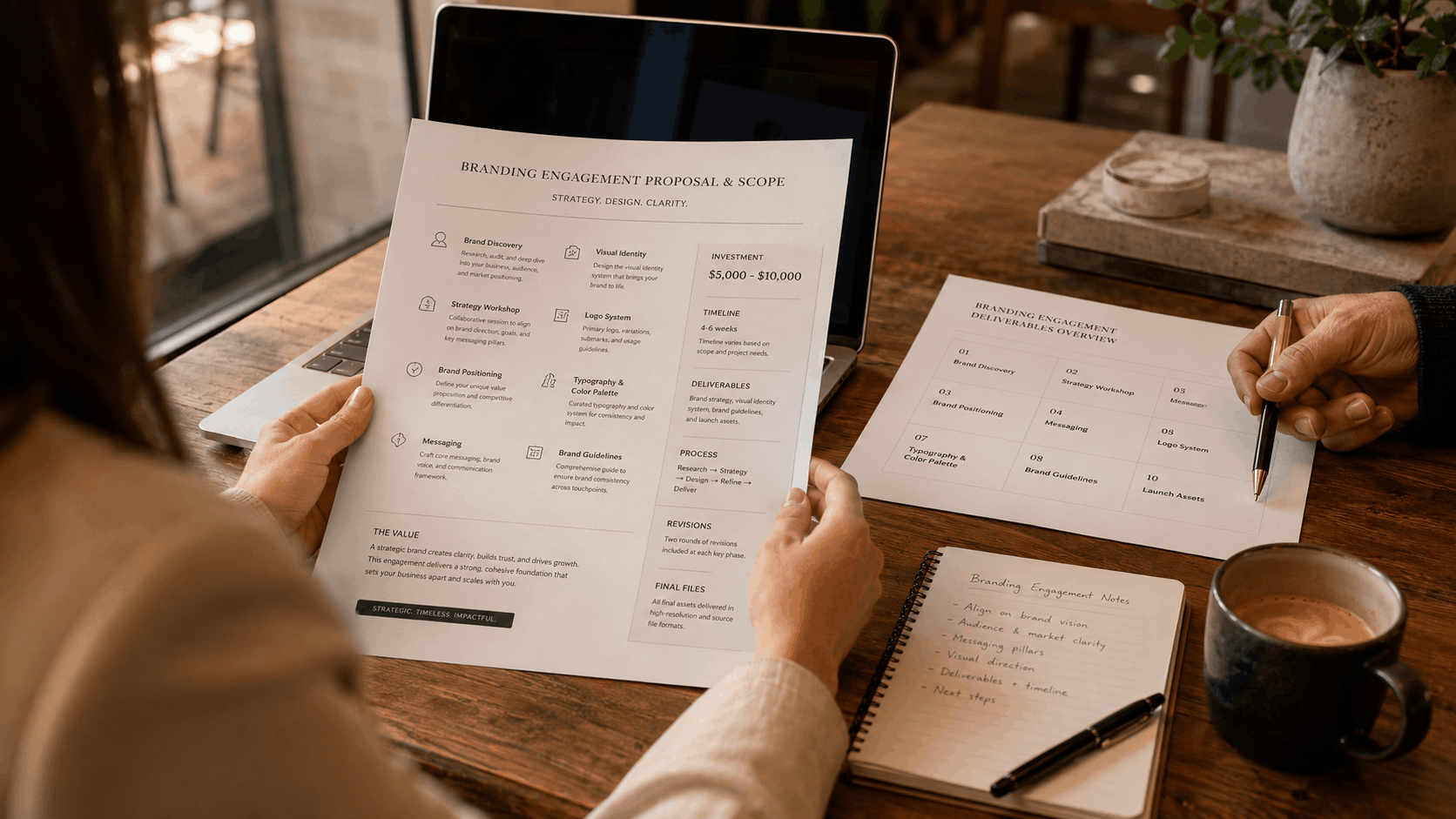
What a $5K–$10K Branding Engagement Actually Includes
Most founders have no idea what they're buying when they invest in branding.Not because the inf...
RReeaadd mmoorree
6/28/2026
What We Look for Before Taking on a Client
Most agencies say yes to almost everything. A budget shows up, a brief arrives, and the work begins....
RReeaadd mmoorree
6/27/2026
Why the Last Agency Didn't Move Your Numbers
Your product looked better after. The website was cleaner. The rebrand felt like progress.Then three...
RReeaadd mmoorree